jmtd → log → loading (unintended consequences?)
For their 30th anniversary (ish; the Covid pandemic pushed the date out a bit) British electronic music duo Orbital released the compilation 30 something. The track list mostly looks like a best hits list, which — given their prior compilation celebrating 20 years looks much the same — would appear superfluous. However, they’ve rearranged and re-recorded all their songs for 30, to reflect their live arrangements. The reworkings are sufficiently distinct from the original versions (in some cases I prefer them) and elevate the release. The couple of new tracks are also fun, and many of the remixes on the second disc are worth a listen too.
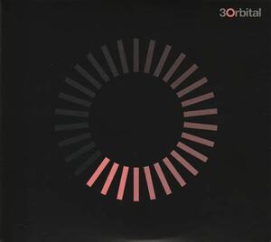
But what I actually sat down to write about was the cover artwork. They often have designs which riff on the notion of a circle (given their name) and the 30-something art (both for the album and single takes from it) adapts a “loading” spinner-like device from computing (I suppose it mostly closely resembles the spinner from macOS).
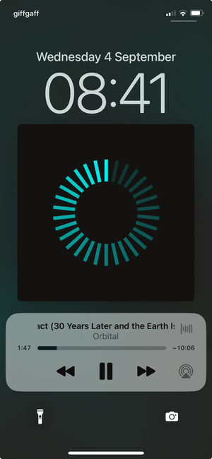
A possibly unintended effect of the pattern occurs when you view it on a display which is adjusting its brightness, such as if you’re listening to it on a phone, the screen is off, and you pick it up. The brightest part of the spinner is visible first, and the rest fade into visibility in sequence. The first time you see this is unexpected and very cool. (I've tried to recreate it in the picture below, but I don't think it's worked.)
Although I've suffixed the titled of this post unintended consequences?, It's quite possible this was deliberate.
I’ve got the pattern on a t-shirt and my kids love to call out “Daddy’s loading!” In my convalescence it’s taken on a special sort of resonance because at times I’ve felt I’m in a holding state: waiting for an appointment to be made; waiting a polite interval before chasing an appointment; waiting for treatment to start after attending an appointment. Thankfully I’m at the end of that now, I hope.


Comments